Hoarding graphics are an essential part of any urban development project, concealing dusty building work and keeping members of the public safe. These graphics also present a huge advertisement opportunity that shouldn’t be ignored.
Within a busy area, there’ll be hundreds of potential customers passing by each day, so it’s important to try and draw their attention to your development as much as possible. Tapping into their curiosity with eye-catching hoarding graphics is the best way to do this.
The most effective hoarding graphics aren’t created my pure fluke or mistake, a lot of time and effort goes into their design. Here are five ways you can get the most from your hoardings:
1. Create a cohesive concept
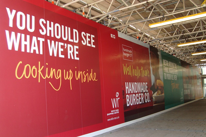
Although your hoarding graphics are most likely to be made up of a series of panels, the design should flow across the whole space. This will not only look good from afar, but help to hold the attention of passers-by, making your message more memorable.
Investing some time in a good design concept will enable you to create something interesting and informative that naturally draws you in. This will help you to make the most of your whole space.
2. Make people curious
Whether you’re building a new restaurant, department store or high-rise apartments, generating curiosity helps to get people thinking – and talking – about what’s to come.
Use high-quality images to drop hints about what could be behind your hoarding graphics. This way people will start to take an interest before your project is even completed.
3. Talk to people directly
When it comes to printed advertisements, nothing grabs our attention more than text addressing us directly. Pose a question such as ‘Fancy waking up to this each day?’ or use a statement like ‘This is the dining experience you’ve been waiting for.’
Questions and bold statements naturally provoke a reaction, which helps a message to become more memorable. This is particularly useful when it comes to pedestrians and people sat in traffic, who will only have a couple of seconds to register your hoarding graphics before moving on.

4. Make it bright and colourful
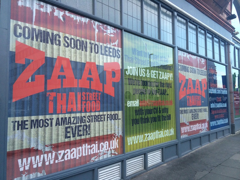
Simply put, the more eye-catching the design, the more people will recognise your hoarding graphics. And the more people who see your hoarding graphics, the more people know about your project!
However, be wary of making your printed graphics too busy and overbearing. Instead, balance a few select colours, using one or two bright tones. Bright, cheerful graphics will set the tone for what’s to come and position your development as something exciting to look out for.
5. Encourage people to engage
Including contact details is a must. Not only the website, logo and contact details of the end business, but any relevant social media channels too.
If people are intrigued by the development, the first place they will go and look is online and on social media. Having this information clearly displayed means you can begin capturing leads way before your project nears completion.
Want some help making your hoarding graphics stand out for all the right reasons? Talk to one of our experts about your space and we’ll recommend the best solution for you.


