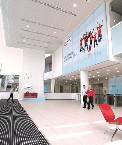
Office branding: Don’t make these common mistakes
Have you tapped into the benefits of office branding yet?
It brightens up your workspace and makes it feel like your own. It also creates a fantastic first impression for visitors and can even help your employees to feel more engaged.
If you’re thinking about investing in some office branding, it’s good to do a bit of research first. And if you’re reading this blog, you’ve come to the right place. We’re here to tell you about the most common mistakes companies make, so you can avoid making them yourself.
MISTAKE #1: Including information that could go out of date
Will your content stand the test of time?
Make sure the answer is ‘yes,’ or you may end up kicking yourself….
Imagine creating a beautiful ‘meet the team’ wall display only for Janet from sales to leave the following week. Or imagine having window graphics printed featuring your top client logos, only for your client base to have changed by the following quarter. These are common but preventable errors.
Your office branding should be relevant and reflective of your organisation, so stick to concrete facts only. Don’t be tempted to include details you know could change or become outdated. This will leave you with costly amendments (and most probably test your patience too).

Make sure your graphics look bright, colourful and exciting
MISTAKE #2: Being too corporate
The purpose of office branding is to brighten up your space, so make sure it does exactly that.
Your finished graphics should always be professional, but try to ensure they’re exciting to look at too. Use colour, text and graphics and think beyond traditional door signs and banners. There are dozens of different ways to use a blank wall, so get experimenting! Wall vinyl and branded magnetic boards are two of our favourite products for office interiors.
TOP TIP: Avoid relying too heavily on stock images and generic corporate messaging. Instead, give your employees the chance to input into the creative process and consider commissioning a custom-made design.

An example of generic, corporate imagery to avoid
MISTAKE #3: Being too casual
Yes, your branding should look great, but make sure it’s not too informal.
Strike the right balance!
Remember that the space you’re working with is a working environment that will be visited by clients and other contacts, who you’ll no doubt want to impress. Equally, your office branding should remind employees why the work they do is important. Making your office branding too casual and informal can detract from this.

Keep it recognisable
MISTAKE #4: Not making it personal to your business
The best office branding says: ‘This is who we are and this is why we’re here.’
The worst office branding says: ‘Here’s a blank wall that we filled with a stock photo because we ran out of ideas.’
Don’t fall into the latter category. Make sure your branding is, in some small way, reflective of who you are as a company and what you stand for. This could be as simple as including your company vision, some relevant symbols or a quote from a satisfied customer. Or why not create a visual nod to your biggest achievement to date? Whatever it is, make sure it’s unique to your organisation.
MISTAKE #5: Branding overkill
Less is more when it comes to branding.
Even the most neutral brand colours can become garish when placed on every wall, floor, ceiling, door and surface. Stick to a few feature walls and smaller details, like doorway signs, reception desk graphics and displays in communal areas.
Think carefully about your space and the type of branding that will work the best. If it’s a bright, light warehouse, you’ll be able to get away with bigger pieces than if it’s a compact office. Working with a company that conduct site visits and supply visual mock-ups is the best way to make sure you order effectively.
Have you found this advice useful? Or do you have further questions about office branding you’d like to share with us? You can get in touch on 0113 278 3133 or via sales@digitalplus.co.uk.


