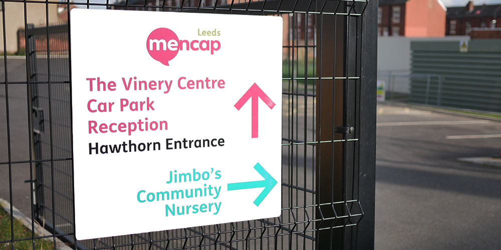
Signs play a crucial role when it comes to providing all-important wayfinding and site safety advice, which means it’s particularly important that what they communicate is 100% right.
Like most forms of communication, signs carry key messages, but unfortunately, these key messages can easily be misinterpreted, overlooked or simply ignored.
However, in the world of signs, especially signs that are designed to carry essential health and safety advice and help prevent injuries, accidents, and even fatalities, it’s essential the messages are seen and understood by all.

The most effective wayfinding and site safety advice signs don’t just happen by chance, time and consideration has been taken into their design and the messaging
What do we mean by wayfinding signs?
These types of signs are available in all sorts of different options, as floor plans, area maps, building directories, street signs and directional signs. (More on this a little later in the blog).
On the whole, the principle remains the same, to make it easy for people to know where they’re going and how to get from A to B, whether that’s on foot, in the car on the train or via other forms of transport. I.e. How to get to Platform 12A; from the car park to the main entrance; from one hospital department to another and from the main reception to the kitchen….
The best wayfinding signs almost always tend to follow these four design rules:
- Create a unique identity at each location – this can easily be achieved by using colour-coded backgrounds or basing the sign designs on themes.
- Incorporate landmarks/special features to provide orientation cues and memorable locations – for example, sculptures or greenery alongside signage for maximum effect.
- Create well-structured paths – that are clearly mapped out using signs that are strategically positioned at key points along the way.
- Don’t give people too many navigation choices – instead, be selective with your use of wayfinding signs, you don’t want to overcomplicate pathways by giving people too many different instructions.
These dos and don’ts are particularly important too:
DON’T make people think too hard about their routes.
DO create clear designs that can be understood by everybody.
DON’T overload your signs with information.
DO put yourself in the shoes of your sign users.
DON’T rush the sign design process.
DO carefully consider every single square inch.
DON’T forget to double-check your signs for errors!
DO use a clear font in a large enough size.
Generally speaking, wayfinding signs can be grouped into three categories: directional signs, identification signs and warning signs, which brings us nicely to the next part of our blog – how signs can help with site safety.
Signs are central to helping maintain safety, particularly in busy areas and where dangerous work is taking place, i.e. on construction sites, in packed shopping centres and congested high streets. It can be easy to take them for granted because they’re literally everywhere, but you’d be surprised at just how effective the important messages they convey are at showing us what to do and what not to do (whether or not we realise it at the time!)

Some examples of site safety signs
Chemical storage area, hazardous area, danger – construction site, no entry, fire exit, no unauthorised entry; protective clothing must be worn, the list goes on.
Site safety sign design
In most circumstances, signs that carry specific site safety messages should follow the golden principles of sign design we’ve shared with you above. However, certain statutory safety signs must also comply with the Health and Safety Executive’s guidance. For instance, colours alone indicate certain meanings or purposes:
- Red = prohibition sign/danger alarm
- Yellow/amber = warning sign
- Blue = mandatory sign
- Green = emergency escape/first aid sign/no danger
The overall make-up and composition of these types of signs should also be designed in accordance with the HSE’s Safety Signs and Signals guidance. Failure to comply with the HSE’s guidelines means that the signs won’t comply with the Health and Safety (Safety Signs and Signals) Regulations 1996 and the company they belong to won’t be fulfilling their legal health and safety in the workplace duties.
The power of signs in providing wayfinding and site safety advice should never be underestimated. They can help create a good customer experience, promote businesses to passers-by, attract customers, communicate essential safety advice plus, so much more.
We hope you’ve found this wayfinding and site safety advice a useful starting point for designing your wayfinding and/or site safety signs. If you would like further information or would like to discuss your sign design requirements with us, contact us on 0113 278 3133 or by completing our short form.


